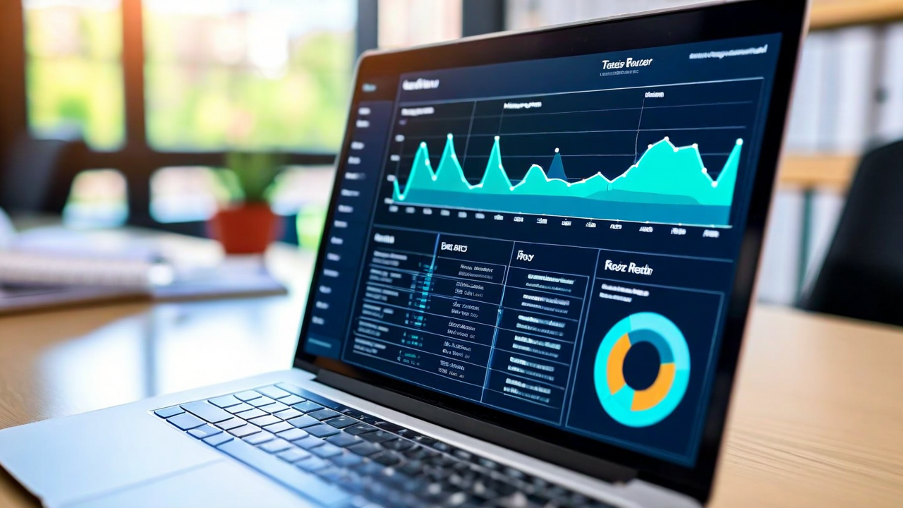
Every edtech platform has a teacher dashboard. Most of them are genuinely impressive — rich with data, interactive charts, exportable reports, year-over-year comparisons, skill heatmaps, engagement metrics, time-on-task breakdowns. Companies spend a lot of money building these dashboards.
And then teachers don't open them.
We spent a year talking to teachers about their relationship with edtech dashboards before we built ours. The pattern that came up constantly was this: the more data a dashboard showed, the less useful teachers found it. Not because teachers aren't good with data. Because a teacher managing 28 students, 5 subjects, and 6 hours of active instruction time cannot also manage a BI tool.
What the Research Says About Decision Fatigue
There's a well-documented phenomenon in behavioral research called decision fatigue — the degradation in decision quality that comes from making too many choices. Teachers make hundreds of small decisions every day. What they need from a dashboard isn't more information. It's the right information, presented in a way that generates a clear next action.
A study published in the Journal of Educational Technology in 2024 found that teachers who used dashboards with more than seven primary data views checked them significantly less often than teachers whose dashboards showed three or fewer. The teachers with simpler dashboards also reported higher confidence in their data-driven decisions. Less data, better decisions. The result seems counterintuitive until you think about what a teacher needs in a five-minute planning window between classes.
The Design Philosophy Behind Our Dashboard
When we were designing LearnPath's teacher view, we started with one question: what does a teacher need to know in two minutes or less that will actually change what they do today?
The answer turned out to be three things.
Who's stuck right now. Not who's been struggling for six weeks — who is actively unable to progress through today's material. These students need attention before the session ends.
Which concept the class as a whole is weakest on. This is the reteaching signal. If eight of my 24 students haven't mastered the same skill, that's a small group lesson waiting to happen. One concept, one session, seven students catch up. That's efficient.
Who's ready for a bigger challenge. This one gets overlooked. High-performing students who are coasting through grade-level material are also a teacher's responsibility. A quick glance at who's moving faster than expected gives teachers an opportunity to extend those students before boredom sets in.
That's the default view. Three signals, one screen. A teacher can absorb it in 90 seconds and walk into class with a plan.
What We Hid (and Why)
Every piece of information on the default dashboard is something we deliberately chose to surface above others. That means there's a lot we chose to de-emphasize — not remove, but move behind a click.
Time-on-task is a good example. It's technically interesting data. It's also not very actionable. A student who spent 18 minutes on a problem set instead of 22 may have been faster, or may have clicked through without engaging, or may have been pulled away for an unrelated reason. Without additional context, the number doesn't tell a teacher much. We put it in the detailed student view, accessible to teachers who want it, but not on the front page of the dashboard.
Similarly, engagement trend lines — charts showing how a student's engagement score has changed over weeks — are the kind of thing that's useful for a quarterly review meeting, not for planning tomorrow's lesson. We didn't hide them. We organized them appropriately.
The Teacher Feedback Loop That Shaped Version 2
We launched our first dashboard version to a cohort of 40 teachers across three districts in early 2024. After six weeks, we ran structured interviews and looked at usage data. Two things stood out.
First, teachers wanted the "stuck right now" signal to arrive as an alert, not something they had to navigate to. A notification — even just a subtle badge on the app — was enough to prompt them to check. Without the notification, many teachers forgot to look during the session. With it, they checked within minutes.
Second, teachers wanted to be able to dismiss a recommendation after they'd acted on it. If they'd already pulled the four struggling students for a small group, they didn't want those students still flagged as urgent on their next login. The dashboard needed to understand that teachers were already responding to the data, not just observing it.
Both of those changes went into version 2. Adoption rates increased significantly. More importantly, when we interviewed teachers six months after launch, the ones using the dashboard consistently described specific recent decisions they'd made based on it — which students they'd pulled for a small group, which concepts they'd reteached, which students they'd challenged with extension work. The data was translating into classroom action. That's the actual goal.
A Note on What Dashboards Can't Do
A dashboard surfaces patterns. It doesn't explain them, and it doesn't replace the teacher's knowledge of a specific kid.
A student who's suddenly stuck on a concept they mastered last month might be dealing with something at home. A student who's been clicking through quickly might be racing a friend rather than engaging. The data tells you where to look. The teacher decides what to do about it.
We designed the dashboard to make that handoff as clean as possible. The information flows to the teacher. The teacher decides. That's the right division of labor between a software tool and a professional educator — and it's one we thought about carefully every time we had to decide what to show and what to put behind a click.